In my last post I discussed some of the great aspects of Professor Krislov's midterm elections course. In this post I thought I would continue with the theme of classes by talking about Professor Witmer's Statistics and Modeling course, and how it is kind of taking over my life.
AP statistics was one of my favorite parts of high school. The combination of the interesting course material and an awesome teacher made the class a fulfilling experience. With this background I was motivated to pursue more statistics at Oberlin.
Statistics is a discipline for those with a curious attitude and a desire to understand the world. In class, Professor Witmer presents data that confirm preconceived biases and challenge well-established ideas. One memorable, and saddening, example involved data on convictions of homicide in Florida. The data included the race of the suspect, if they were convicted, and the race (white or African American) of the victim. A surface level glance at the data suggested white suspects were convicted more overall. However, when breaking the data down further by examining rates of conviction by race of victim, African American suspects had higher rates of conviction in both categories of African American and white victims. In short, when the data was aggregated and not broken down by race of victim, a higher rate of whites were convicted, but when the data was segmented by race African Americans had higher rates of conviction. The solution to this paradox is that the important variable is not race of suspect, but race of victim. Overall, when a victim is white the suspect is more likely to be convicted than if the victim is African American. This is a sad testament of the ongoing racial inequities in America.
A rather peculiar data set Professor Witmer analyzed in class tested for a physiological response of pupil dilation among people of different sexual orientations when observing nude pictures. The researchers that conducted the experiment broke subjects that identified as homosexuals and heterosexuals into separate groups. They were then presented with nude photos of people of their same gender. The researchers recorded pupil dilation in each case. They found that heterosexuals experienced a pupil contraction whereas homosexuals' pupils dilated.
I will never forget walking into class the Monday after Halloween. Professor Witmer had a distribution on the projector portraying the number of kids that annually went to his house to trick or treat. The plot showed numbers he had recorded for over a decade. Recently, the class has been analyzing data on a golfer's putting accuracy as the putt length varies. Professor Witmer made it known that a certain statistician had to toil arduously on a golf course to collect this data. Earlier in the year I was playing around with the pedometer on my phone. I decided to make a distribution of my daily step rate since I got to Oberlin. Happy with my unusual use of stats, I emailed a picture of the distribution to Professor Witmer. I got a response within an hour of his daily step distribution over the same time period. All of these examples demonstrate both the level of passion and creativity Professor Witmer has for statistics.
The passion and creativity is contagious. Recently, I have begun using statistics in Professor Krislov's election course to analyze the role of money in Congressional House races in the 2014 midterm election.
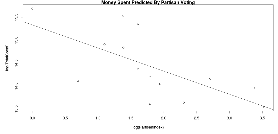
Some of my analysis involved the Michigan House races. Overall, there is a negative correlation between how severely voting is skewed toward a particular party and the amount of total money spent on elections. In this graph each point represents a district within Michigan. The horizontal axis displays an index of how skewed the district tends to vote. The vertical axis shows amounts of money raised for each candidate and all outside spending in the district aggregated. The last two points represent the thirteenth and fourteenth districts in Michigan. Both of these districts are in the Detroit area which heavily votes Democrat. In these districts candidates raised very little and outside spending organizations spent negligible amounts. This makes intuitive sense. If a district heavily favors Democratic candidates, Republicans won't waste their money in the district, and Democrats have no incentive to put money into a district in which they have firm control.

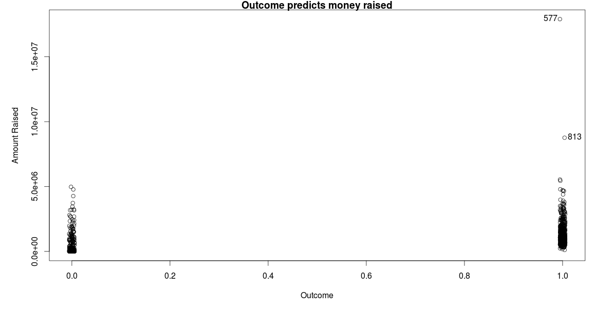
This next plot shows data on all House races for the 2014 midterm elections excluding the races in Louisiana. Louisiana is having a runoff election on December sixth to determine winners in some of these races. On the horizontal axis a zero for outcome means the candidate lost the election, whereas a one suggests they won. On the vertical axis I put the amount of money candidates raised as of the last FEC reporting deadline on October fifteenth.
Now, you might be wondering about the two kind of strange points which have much larger rates of money raised than the other candidates. On the graph these points are denoted as 577 and 813 which represent their row location in my data set. Point 813 is Representative Paul Ryan, Mitt Romney's running mate in 2012; and point 577 is Speaker of the House John Boehner. The candidates raised $8.8 million and $17.9 million, respectively. These numbers aren't fully appreciated unless put into context. Among all 843 general election candidates that I analyzed, the median amount of money raised was only $778,000. Ryan and Boehner raised 11 and 23 times the median!

From my time in Professor Witmer's course I have learned that statistics is a discipline with a web-like nature. Statistics oozes into everything. Other academic disciplines use it heavily to test the viability of models, journalists use it to inform, and policymakers use it to guide policy decisions. However, at Oberlin I have learned the usefulness of statistics transcends finding correlations and exploiting those correlations toward some end, say as a vehicle to determine the solvency of the Affordable Care Act. Statistics is, at its core, exploratory. And it rewards creative thinking.

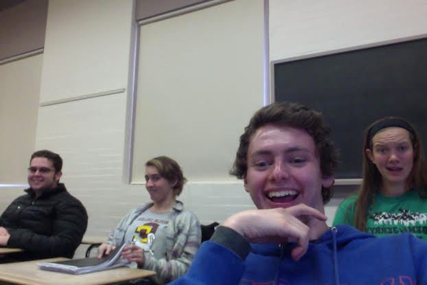
This is a picture of my friends and me before statistics.
Citations:
The data I analyzed in this post is from the Federal Election Commission and The Cook Political Report.


