Artifacts from the summer.
Karl Orozco ’13
It's show and tell time! Who doesn't love show and tell? Actually, I probably didn't because I was a shy little booger from ages 5 to 14. But since that's the case, this blog will make up for any feebler, former, and sheepish-er attempts pre-Oberlife.
I mentioned, say, four blogs ago about my summer internship at the Bread and Butter Collective and the design-related works I had done for them. However, I conveniently forgot to mention a couple of other things I had been working on. And by conveniently, I mean that I purposefully left them out because: A. They weren't done yet; B. I thought they deserved their own blog post; and C. More spare blog posts are always welcome!
Megan Harding from Oberlin's Office of Communications commissioned me to redesign Oberlin College's posters that are sent to high schools for prospective students to look at and say, "Hey! I wanna be there!" The previous visit poster, shown below, has been in use the past 4 years.
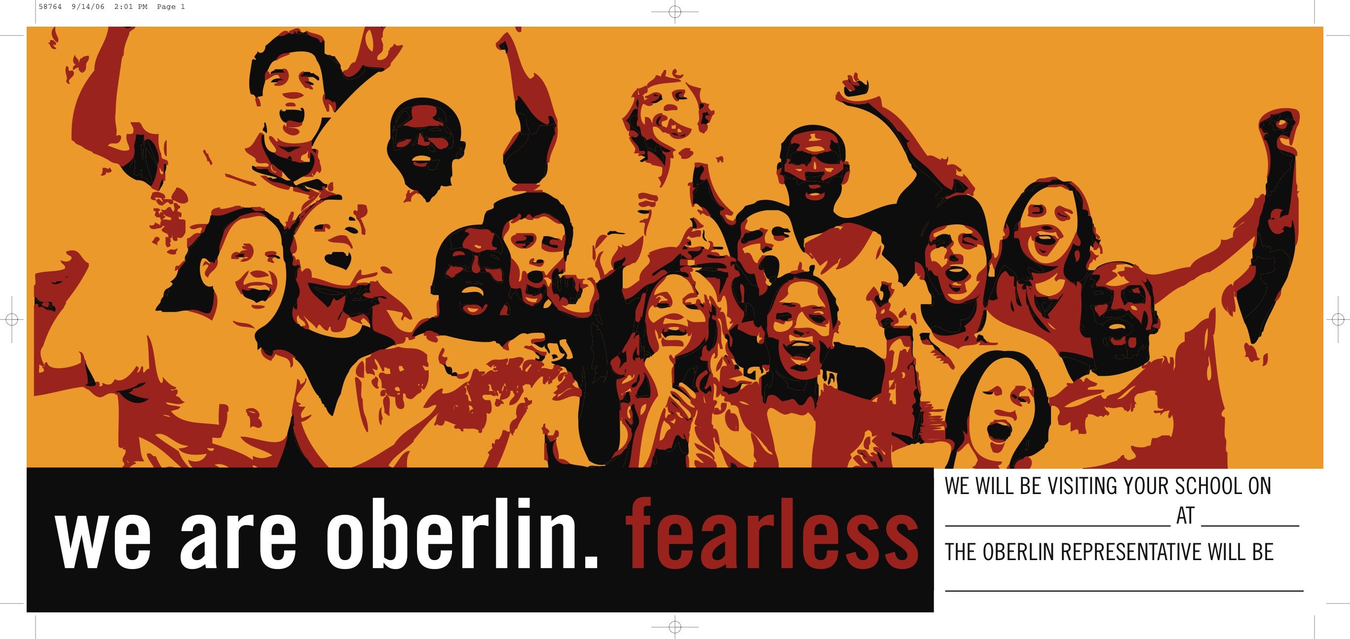
With the dismantling of Oberlin's "Fearless" campaign, the new visit posters needed to be something un-Fearless. Something... Fearful. Cowardly. Apprehensive. Timid. Faint-hearted.
Okay, well, not really. Note that I was reading the antonyms of "fearless" off a thesaurus. We didn't want Oberlin to be represented as any of those timorous, spineless adjectives (Have I mentioned that I love thesauruses and that I probably use them way too much?). We did, however, want Oberlin's posters to be something different from your typical college visit poster with leafy landscapes on autumn days (Not that there's anything wrong with any of those things!). Thus, I present you:
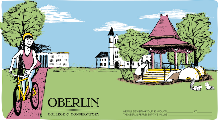
Ta-da! I took quite a bit of stylistic cues from my silkscreening background, which probably lends to the lack of gradients, shading and complicated textures. But despite the posters being digitally printed and not screen printed, I think it'll translate fairly well to a smaller size. I, for one, am pretty happy with how it came out.
There were a couple of other combinations that I was particularly fond of that I'd like to show (and tell, I suppose) here. Mainly, this number:
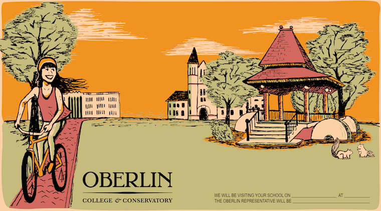
Not that this is of any importance to anyone, since it won't make its way to any high schools. I do, however, find it awesome to discover the evolution of a poster and its color variations. Does that make me a geek? A poster geek? Yes, and yes. Sigh. Who am I kidding?
Another job that I worked on over the summer is for a movie that has gotten quite a bit of press, both in the Oberlin community and the elsewhere community.
The movie, titled Ivory, is a new movie that depicts the life of several musicians who attend Oberlin Conservatory of Music! Isn't that just strangely coincidentally coincidental? Since I don't feel like getting into a long and telling plot synopsis nor spoil any pieces of the movie, I'll leave this job to someone who has already done that:
"Step inside one of the most competitive conservatories in the world, where the allure of fame, money, and the pressure to achieve a concert career push a group of young pianists to the brink - testing friendship, love, and their sense of community. Andreas Goodman, desperately needing success on the competition circuit, heads to Oberlin - the oldest music conservatory in the United States - to study with Olga Primakova, herself a major competition winner, who he thinks will bring him that success. The experiences he finds there will change him forever."
Boy do I love the magic of copy and paste. Ahem. Back to Ivory. Ben Jones (him again!) helped me get connected with Charles Carre and Laurence Gingold, both Oberlin alums who had a major hand in producing and directing the film. Thankfully, they gave me the awesome opportunity to work with them. And now, the feature presentation:
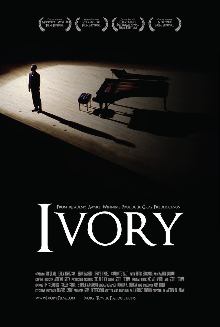
See those fancy little honorific seals of honor at the top? It might be hard to see without zooming in, but they are festival laurels that Ivory has been invited/accepted to. And you see how one of them says "Montreal World Film Festival?" Pretty awesome, if I do say so myself.
It was a little hard to create a very large, 27"x40" movie poster without a set of high-quality shots from a photoshoot, but I think that the poster as it stands makes due with what it has.
Possibly the coolest thing about working with Charles and Laurence is that the movie has a chance of making it to some larger theaters across the nation. Not only is it thrilling to have worked on a film that has a chance to make it to the big screen (well, big-ger screen), but Ivory also uses several shots and scenes from Oberlin's lovely campus.
If you haven't seen it yet, I highly suggest you do. Hopefully there will be future showings of it at The Apollo!
If my blog has had any lasting impression on those who read it, I hope that people realize how awesome Oberlin's Office of Communications is at giving Obies plenty of great opportunities. Not saying that being a blogger is the end-all, be-all, but this connection with Ben Jones and the communications staff is something that I'm very fortunate to have. They've gotten me involved in several of the projects I have worked on in the past year, including both of the posters I just blogged about. Which is why everyone should blog! Or at least, give it a shot! I know this advertisement came a bit late considering that the Oberlin blogger application is due tomorrow... But it's the thought that counts right?
:3
Tags:
Similar Blog Entries
Originating a Role in an Opera's World Premiere
Read about my process learning and performing a world premiere in one month!

Singing Musical Theater for Judy Kuhn ’81
Read about my experience singing in a Music Theater masterclass!
The Best Bands You've Never Heard Of
Oberlin's concert scene has been consistently great, even when I don't know the performers.